How We Infused New Life Into The SIS Brand
Engagement Focus
Branding
Project Overview
When Strategic Industry Solutions (SIS) came to us, their brand identity was, well… stuck in the past. Think floppy disks in a streaming world. Their logo and brand treatment weren’t just outdated—they were probably getting lost in the marketing clutter faster than free donuts at a construction site.
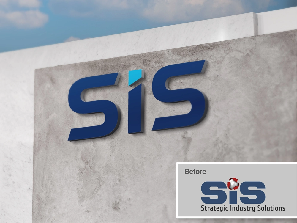
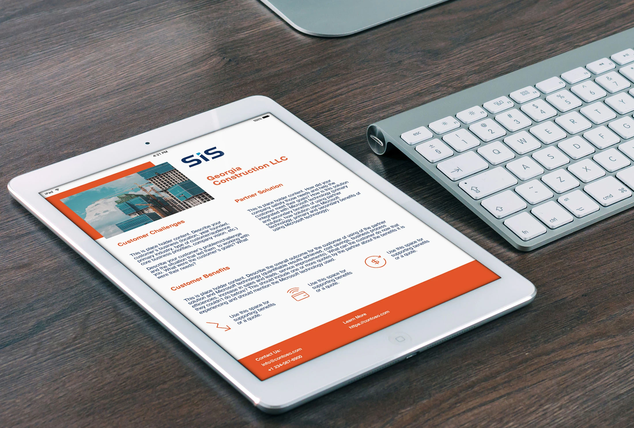
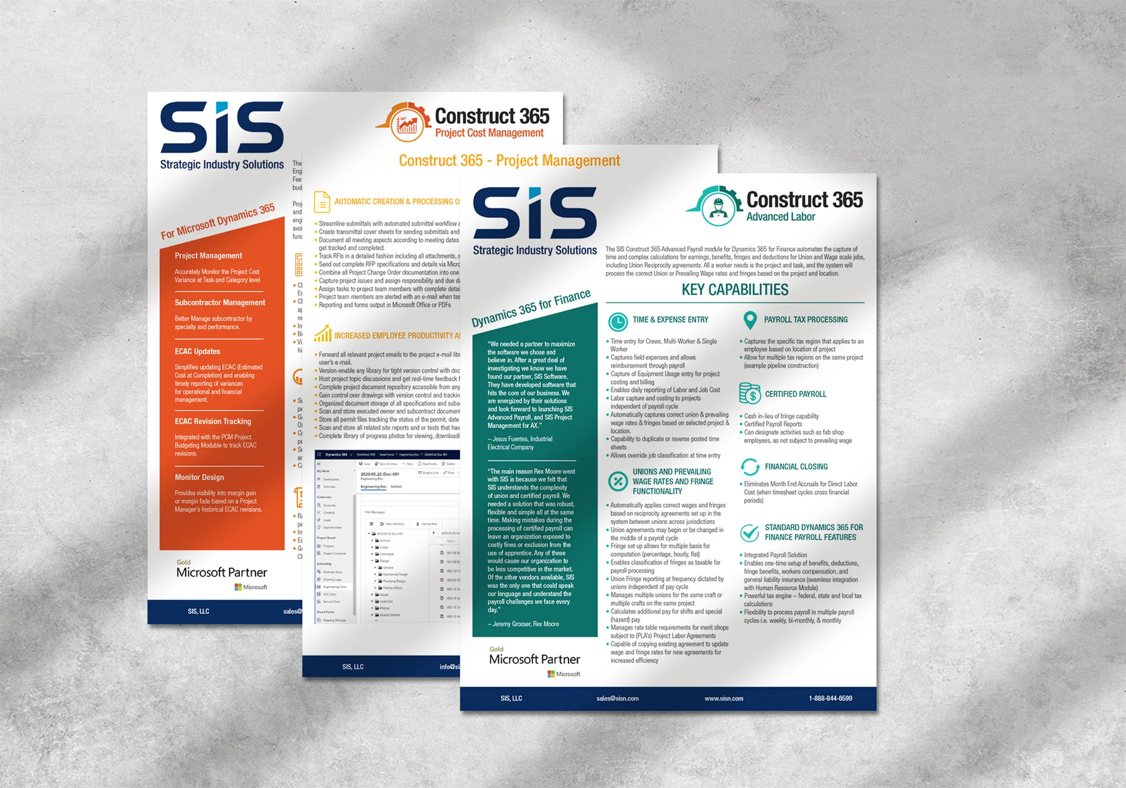
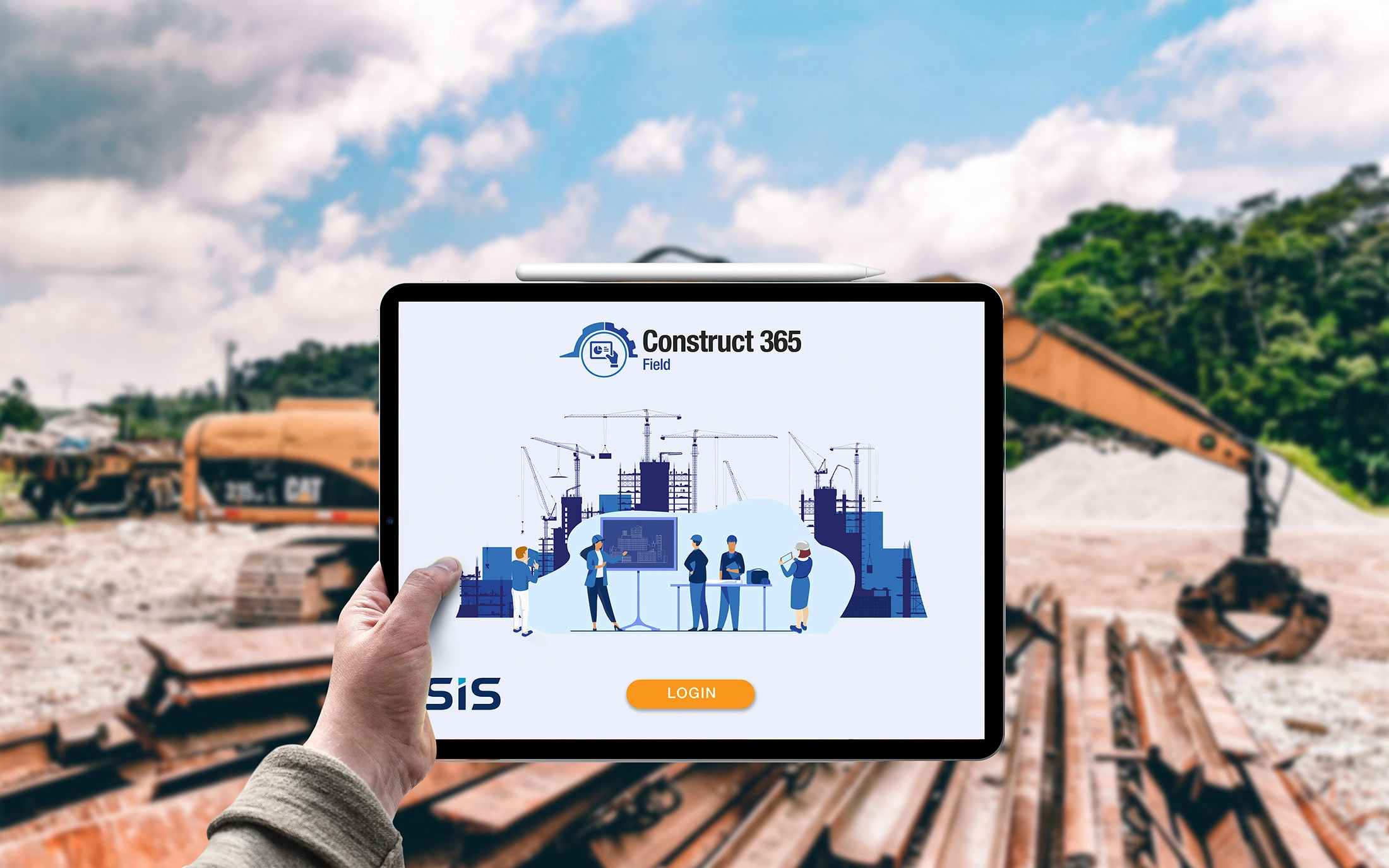
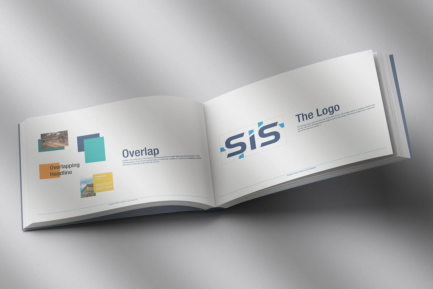
Cue our team at 77 Collective. Through a deep dive into their business (think therapy session, but for brands), we uncovered what really resonated with SIS’s client base. With this insight, we created a sleek, modern expression of their brand, complete with updated product logos, a fresh brand mark, and a shiny new set of brand guidelines.
Since SIS spends its days helping the construction industry stay efficient, their brand had to work just as hard. Our goal was to deliver a clean, polished look that instantly clicks with decision-makers who are busy evaluating tech stacks to streamline their projects. The result? A brand identity that’s as sharp and reliable as the solutions SIS provides.
The Challenge
Strategic Industry Solutions was crushing it in their day-to-day business, but their brand? Not so much. Their logo, brand mark, and overall look were outdated—think flip phones in a smartphone world. Worse, they weren’t cutting through the noise of a crowded marketplace. That’s where we stepped in.
Since the construction industry is SIS’s main audience, their brand needed to deliver a clean, modern vibe that instantly resonated with busy decision-makers. These folks are juggling multiple tech stacks to streamline their processes, and SIS’s brand needed to say, “Hey, we’ve got the solution you’re looking for” before anyone even clicked a link. Challenge accepted.
The Approach
First, we dove into the discovery phase—basically the brand equivalent of a first date, but with sales teams, tech leads, and brand managers. We needed to understand how SIS was seen by its clients and potential customers. Once we had a handle on the brand’s vibe (spoiler: it needed a glow-up), we rolled up our sleeves and created three distinct mood boards to explore different directions. After much deliberation and enough coffee to power a small city, we landed on a clean, geometrically modern stage for the logo. From there, we dug deep into iconography, typography, and color palettes to craft a logo that felt like SIS, but on their best day.
The Solution
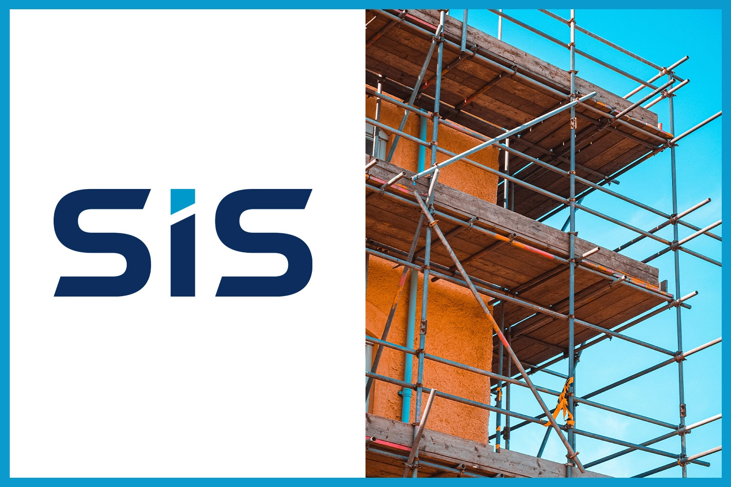
SIS put their faith in our process, and we delivered a brand identity that’s clean, sophisticated, and oozing with modern vibes. The final logo offers both an icon and non-icon version, with typography that features a custom font—complete with angular “S” elements as a subtle nod to their many industry solutions. But the real star? The “I” for industry is designed to represent a constructed building. Functional and clever, just like SIS itself. (We’re patting ourselves on the back for that one.)
Our Solutions
© 2026 Seventy Seven Collective
