For this comprehensive rebrand, 77 Collective dove deep into client strategy to uncover the true essence of what First Advantage stands for. Through extensive research and collaboration, we identified the core values, mission, and vision that drive their business. From there, we crafted a new brand identity that authentically captures the heart of First Advantage, ensuring it resonates with their audience and communicates their industry leadership.
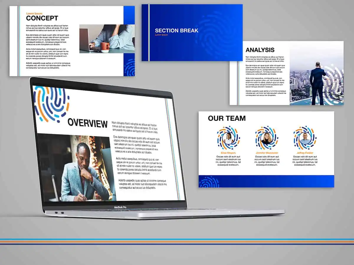
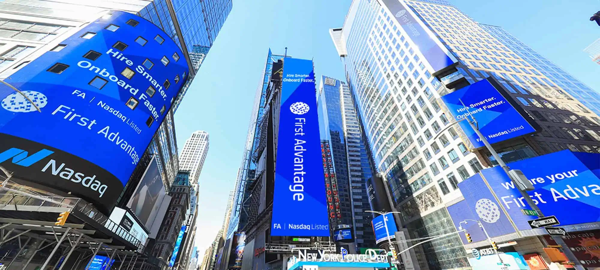
Once the brand was fully developed, we brought it to life across all digital touchpoints, including a modernized website, engaging social media assets, and cohesive digital marketing materials. The result? A refreshed, unified brand presence that reflects First Advantage’s expertise and reinforces their position as a trusted leader in their field.
The Challenge
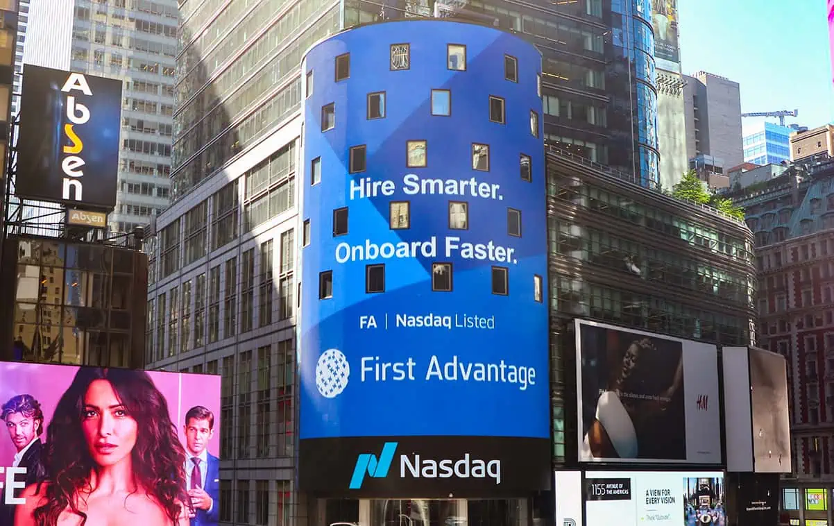
First Advantage has a long history of providing world-class background screening solutions to Fortune 500 companies. However, their logo was outdated, featuring an overly literal depiction of a globe that no longer resonated with modern audiences. They turned to Seventy Seven Collective for a fresh approach to their logo typography and wordmark—one that shifted the focus to “Background Screening” for a clearer and more immediate connection to their core services.
The Approach
The project began with a comprehensive discovery phase. We collaborated with brand managers, sales teams, and tech leads to understand how clients and prospective customers perceived the brand. Internal marketing managers also provided valuable insights, as many design elements would be used for internal marketing materials, webinars, and sales team collateral.
With a clear understanding of the current landscape, we embarked on an exhaustive exploration of iconography, typography, and color palettes to modernize the logo. Our concepts ranged from contemporary interpretations of “F+A” to designs inspired by background screening elements and iconography that reflected the brand’s core promise. The result was a modern expression of the logo that stays true to First Advantage’s identity while positioning it for the future.
The Solution
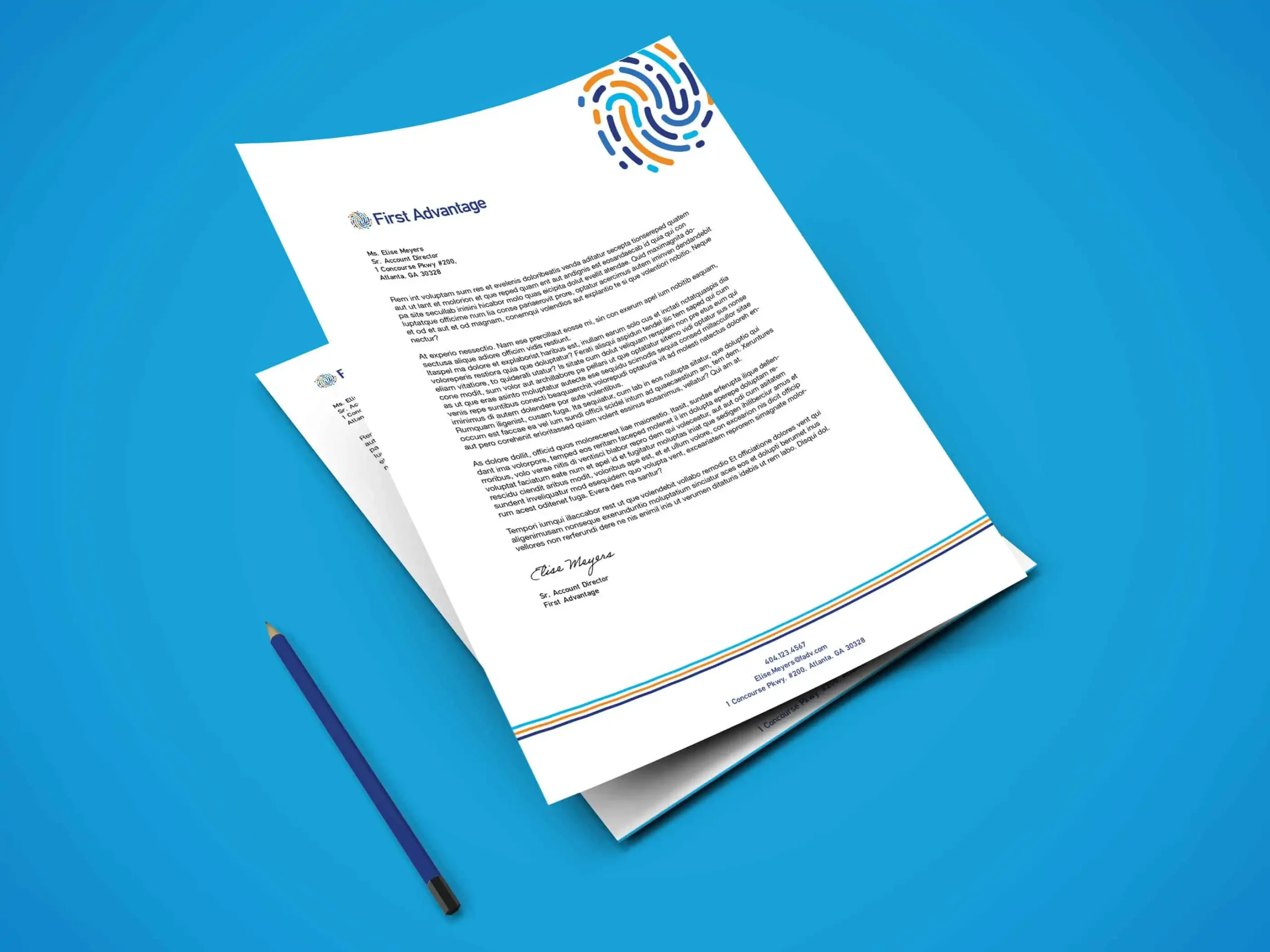
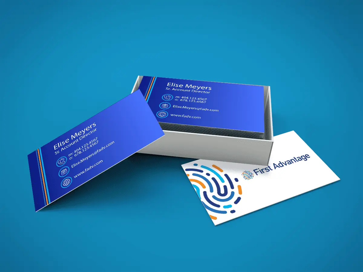
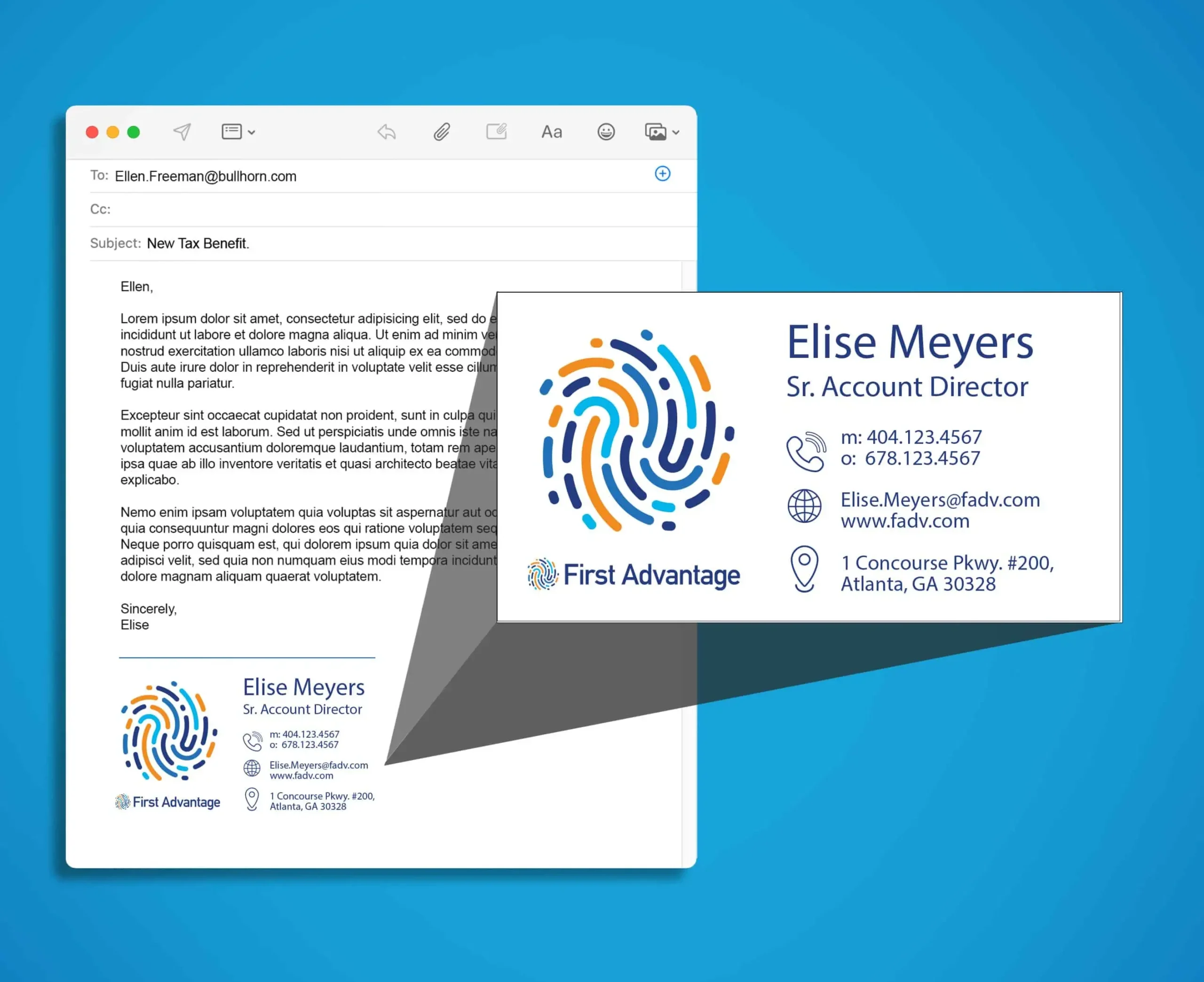
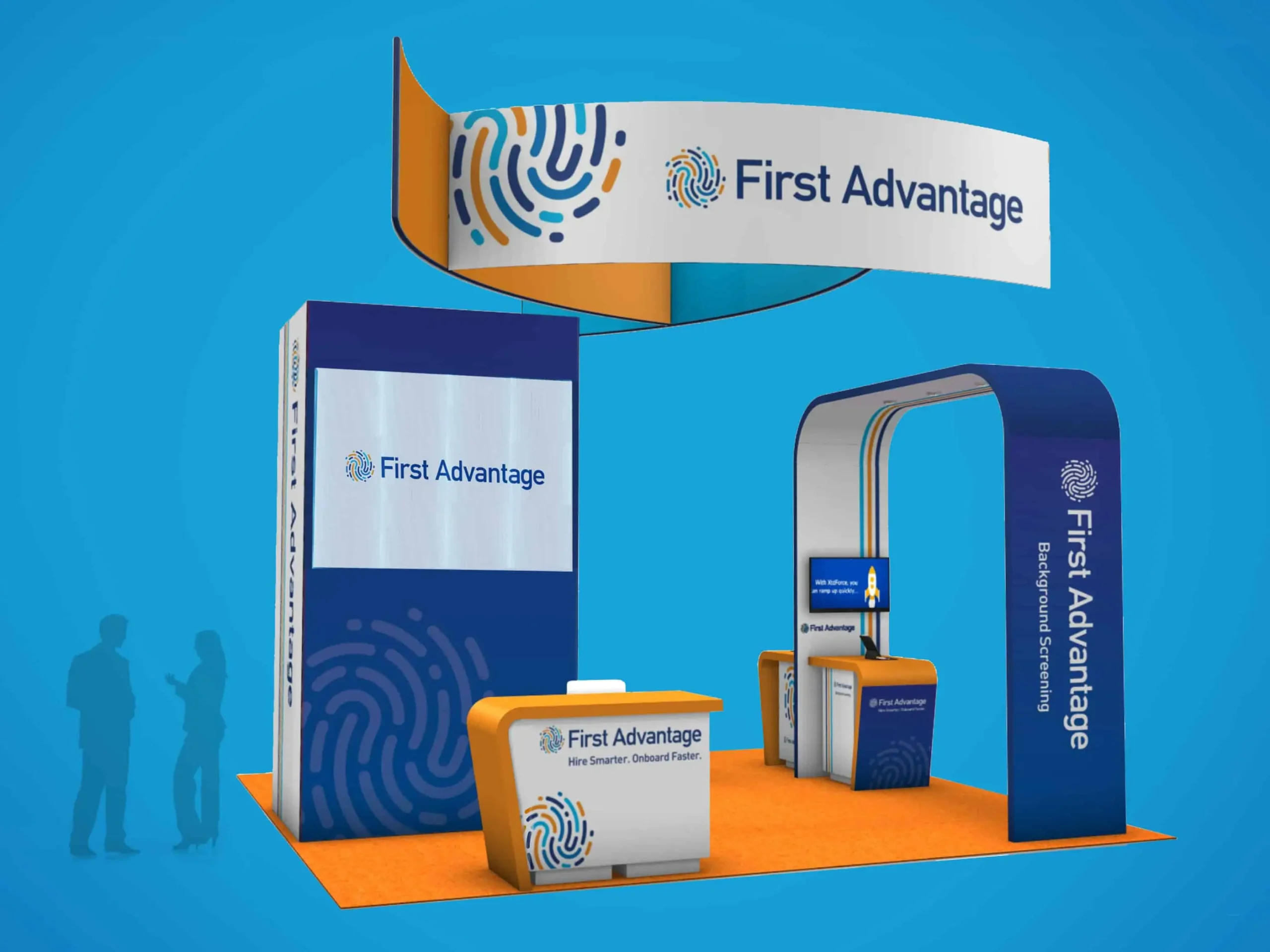
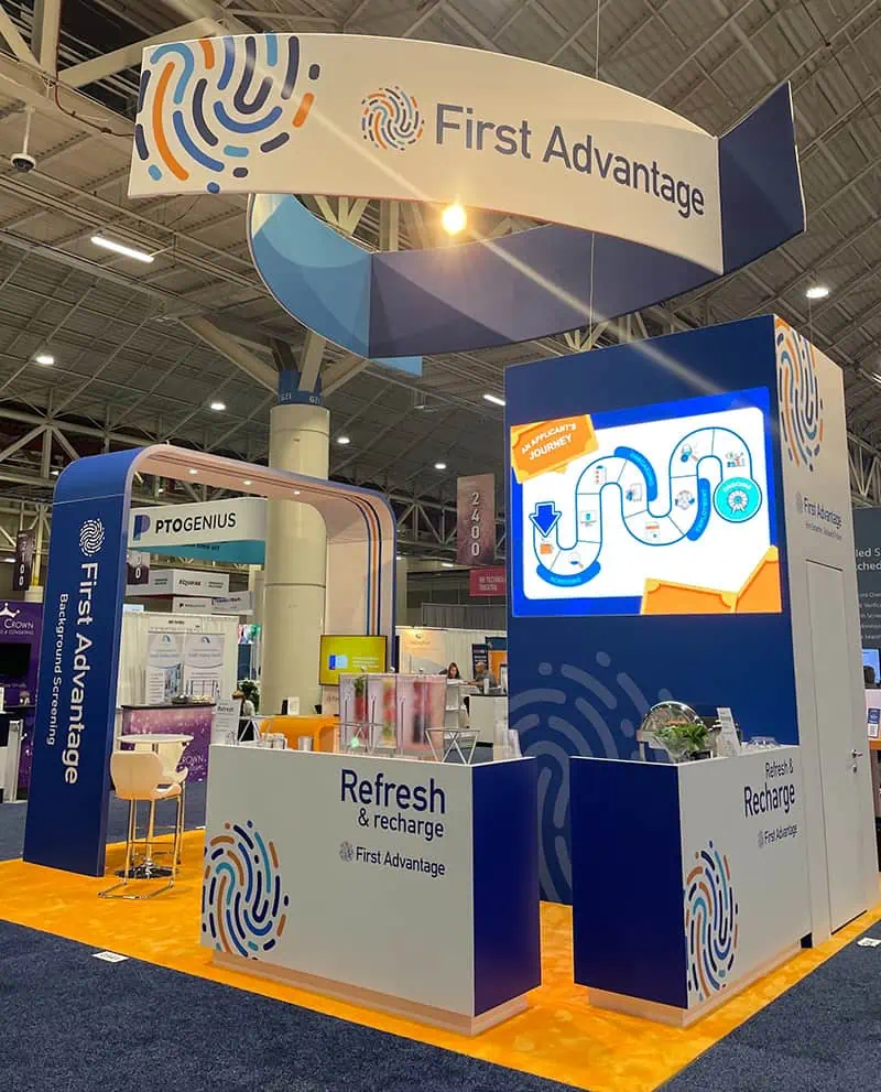
Our process led us to a graphically modern design: a swirling fingerprint-inspired brand mark that conveys movement and depth. This was paired with a classic typeface to create a look that is both versatile and polished. From this strong foundation, we developed brand elements for a variety of media, incorporating overlapping patterns, linework, and bold color combinations with typography to establish a cohesive and dynamic brand presence.
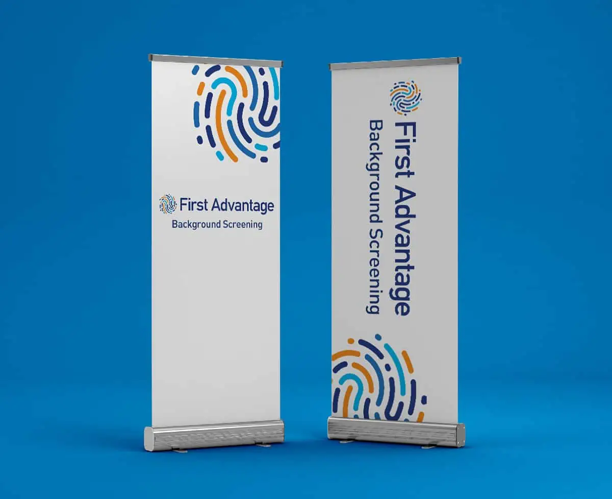
This included modernizing over 30 sub-product logos with updated typography and expressions, designing trade show booths with eye-catching pop-up banners, and creating a complete suite of social media and email designs. Additionally, we provided a detailed blueprint to guide the client in maintaining consistency across future materials and brand expressions.
Our partnership with First Advantage continues as we support their ongoing needs through a wide range of retainer-based projects, ensuring their brand evolves seamlessly with their business.